

Independent Figma study · 2026
Structuring a design system with tokens
I organised colors, typography and spacing into four Figma collections, then defined component types and states separately. The aim was a system whose rules could be inspected and carried into code.
- 01Brand87
- Base values
Palette, typefaces and the numeric scale.
Purple/600 · Scale/200 - 02Alias81
- Brand choices
Brand 1 / Brand 2
Primary/600 · Font family/Heading - 03Mapped44
- Usage roles
Light / Dark
Surface/action · Text/body
Desktop / Mobile Type size, line height and paragraph spacing
Keep values separate from their use
Components refer to roles such as Surface/action. Each role points to a brand alias, which points to a base value. Brand and theme can change independently.
Text styles bind to font and responsive typography variables; spacing uses a shared numeric scale. The JSON reference makes those relationships inspectable outside the canvas.
Brand/Purple/600Alias/Primary/600Mapped/Surface/action{
"Surface/action": {
"type": "color",
"modes": {
"Light": {
"reference": "Alias/Primary/600"
},
"Dark": {
"reference": "Alias/Primary/400"
}
},
"scopes": [
"ALL_FILLS",
"EFFECT_COLOR"
],
"description": "Filled primary action. Pair with Text/on-action; never use as an error surface."
}
}One role, four values
Resolve the reference using the selected brand and theme.
- Brand 1 · Light
#8247C9 - Brand 1 · Dark
#B57AFC - Brand 2 · Light
#CC0000 - Brand 2 · Dark
#FF3333
Define variants as properties
For Button, Type controls emphasis and Status controls interaction. Label text, icon visibility and icon swaps are separate properties, so changing content doesn’t require another variant.
Brand and theme are handled by variables, rather than extra copies of every component.
- TypeVisual emphasis
DefaultOutlinedTransparent- StatusInteraction state
DefaultDisabledHoverFocus
- Label Text
- Left / right icon Visibility
- Icon choice Instance swap
Check the rules in use
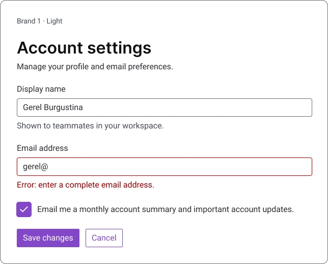
The same component instances form an account-settings screen in two brands and two themes. This is where I checked that typography, color roles and shared spacing worked together.
What the review exposed
Tracing the bindings revealed an incorrect heading line height and weak contrast in several color pairs. I corrected the mappings and documented the intended use of the tokens.
The next step is a coded implementation to test these rules in the browser.